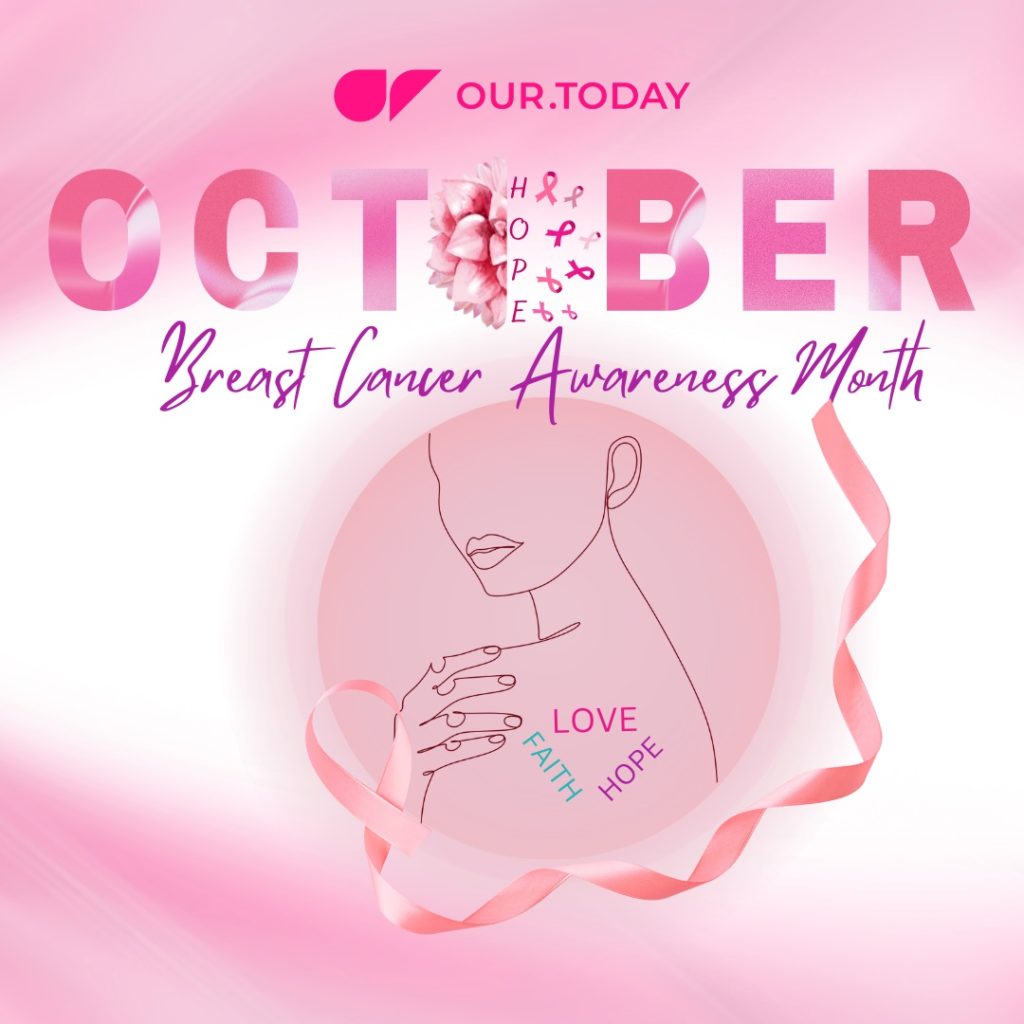
Breast Cancer Awareness – The history behind the pink ribbon

Mikala Johnson / Our Today
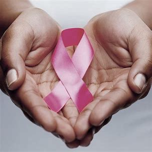
October is Breast Cancer Awareness Month, a period dedicated to educate, facilitate early detection and create change for those impacted by the disease.
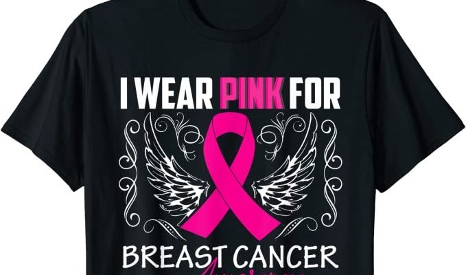
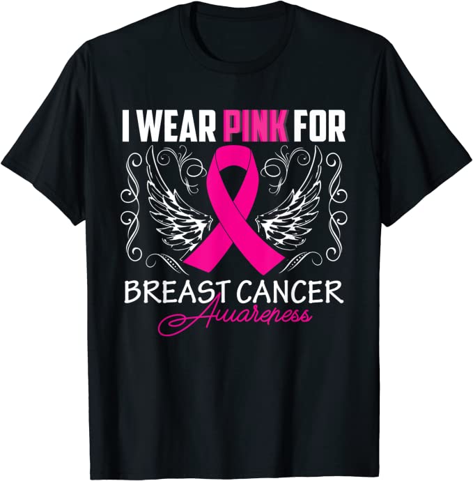
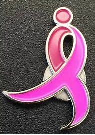
Whether adorned on t-shirts, hats, or clipped on to bags and clothing, pink ribbons are everywhere when October comes around.
Since the annual campaign has just started, it’s a fitting moment to better understand why – and how – pink ribbons have become the now universal symbol of breast cancer awareness.
History shows that the merging of ribbon and symbolism came about different in stages.
The first occurred in 1979, in the early 1970s Irwin Levine and L. Russell Brown penned the song Tie a Yellow Ribbon Round the Ole Oak Tree.
The song would later inspire Penne Laingen, the wife of a hostage who had been taken in Iran, to tie yellow ribbons around trees to bring attention to the national crisis and ultimately to bring her husband home.
The second stage occurred 11 years later, when AIDS activists looked at the yellow ribbons that had been resurrected for soldiers fighting the Gulf War and turned the ribbon bright red.
Awareness ribbons received a star-studded treatment at the Tony Awards in 1991 when AIDS activists got a bright red ribbon, looped it and pinned it to the chest of actor Jeremy Irons to represent those affected by the disease.
The stage was now set for the evolution of the breast cancer awareness ribbon, the pink ribbon.
The final stage involved the Susan G. Komen Breast Cancer Foundation. The foundation is known to have helped pink ribbons go mainstream.
Although the foundation has used the colour pink since its inception in 1982, the first logo design was an abstract female runner outlined with a pink ribbon and was used during the mid 1980s through early 1990s.
In 1990, the first breast cancer survivor programme was launched at the Komen National Race for the Cure in Washington, D.C.
The survivors wore buttons that were printed in black and white. Later that year, the survivor programme developed, and pink was used as the designated colour for Komen to promote awareness and its programmes.
Pink visors were launched for survivor recognition. In 1991, pink ribbons were distributed to all breast cancer survivors and participants of the Komen New York City Race for the Cure.
A year later in 1992, Alexandra Penney, editor-in-chief of Self magazine, wanted to put the magazine’s second annual Breast Cancer Awareness Month issue over the top.
She did this by creating a ribbon and enlisting the cosmetics giants to distribute them in stores all over New York City.
And thus, the birth of the pink ribbon! In 2007, 25 years after its inception, the Susan G. Komen Breast Cancer Foundation changed its name to Susan G. Komen for the Cure. The name change was accompanied by a new brand image.
The new logo included a pink “running ribbon” designed specifically for Komen for the Cure.
This ribbon signifies the promise Komen founder Nancy G. Brinker made to her dying sister, Susan G. Komen, to do what she could to end breast cancer.
Today, any generic pink ribbon can be used to represent breast cancer awareness while the Komen “running ribbon” is reserved solely for use by Susan G. Komen for the Cure.


Comments